Intro
Data visualization is nice, but it can also appear to be boring. In this workflow, I explain the major steps (and the reasoning behind them) on how to obtain art-directable data visualizations.
How to use visual referencing to create an appealing data visualization
Let’s dive into this topic by using Blender. Yes, you heard it right: Blender.
Blender is a free and open-source 3D computer graphics software toolset that runs on Windows, macOS, BSD, Haiku, and Linux. It is used for creating animated films, visual effects, art, 3D-printed models, motion graphics, interactive 3D applications, virtual reality, and formerly, video games.
So, besides its extensive innate capabilities, Blender also has a Python API.
Here is a list of Blender Python features:
- Edit any data that the user interface can (Scenes, Meshes, Particles, etc.).
- Modify user preferences, keymaps, and themes.
- Run tools with custom settings.
- Create user interface elements such as menus, headers, and panels.
- Create new tools.
- Create interactive tools.
- Create new rendering engines that integrate with Blender.
- Subscribe to changes in data and its properties.
- Define new settings in existing Blender data.
- Draw in the 3D Viewport using Python.
For further reading about Blender & Python, click Here
What does this mean?
Specifically, the first and last points in the list above are important. You can edit anything in the UI with Python, like one would by hand. And you can draw in the 3D Viewport. This means you can create 3D objects in the viewport using Python code. Neat!
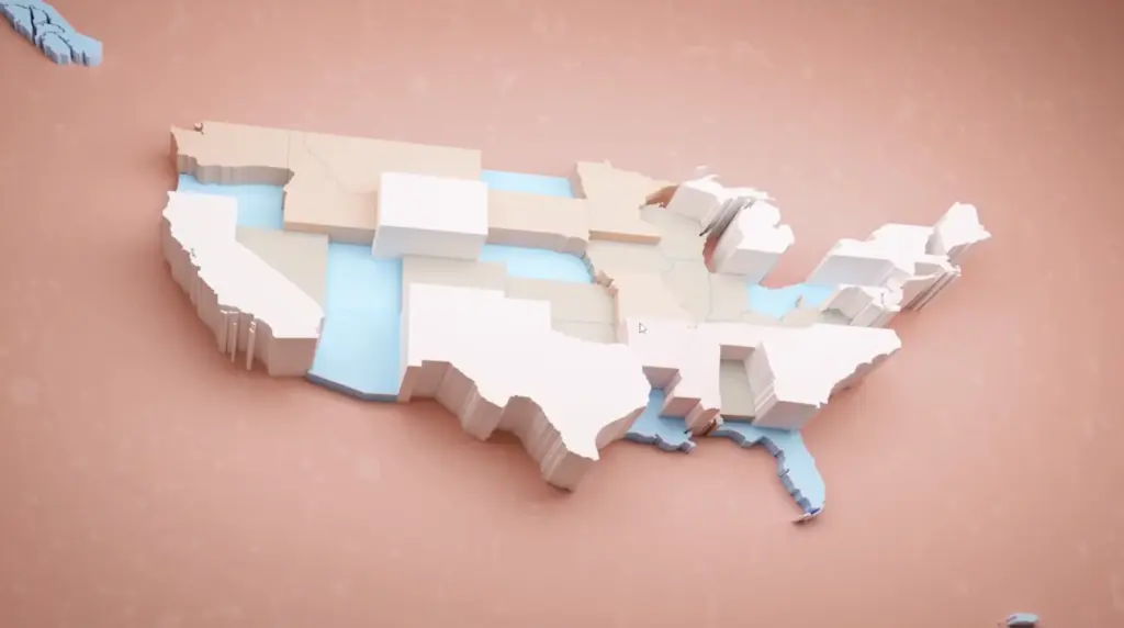
One example would be importing GeoJSON files containing data on the shapes of USA states, assigning them materials, and styling those materials using a reference or a guideline.

In this exploration, I used one of Yahoo’s own article headers, designed by Aisha Y. (My ex-colleague at Yahoo: Aisha’s Website
) So sampling the color can be done in Python via modules. In this example, I sampled by hand, getting 5 key color values.


Color to Data
Say one has 50 data values and wants to use only key colors to drive the visualization. Then one can remap the 50 values into clusters of 10 values.
What else?
Well, Blender is an integrated modeling, texturing, rendering machine! The biased opinion here is intentional, as Blender is my go-to tool for 3D art. I just love it.
Anyhow, I tasked an artist at Yahoo to create an animation/visualization using any tool of his choice. And so he did: Cinema 4D and After Effects. Because Blender also has a compositing space, some basic effects can be produced using the VFX mentality, like glows, flares, etc.
I created a start-to-end pipeline to visualize 3D pie charts, stylized in the artist’s style, based on the following steps:
- Data is read from an online (Google Sheets) spreadsheet.
- Data is converted into a CSV file.
- Once data is downloaded and converted, a Linux process starts Blender.
- The DataFrame is read, and Python sets the various necessary parameters in the Blender file.
- The animation is procedurally generated from the data.
- The render process begins, producing a short animation.
- FFmpeg converts the image sequence into an *.mp4.


GeoJSONs anyone?
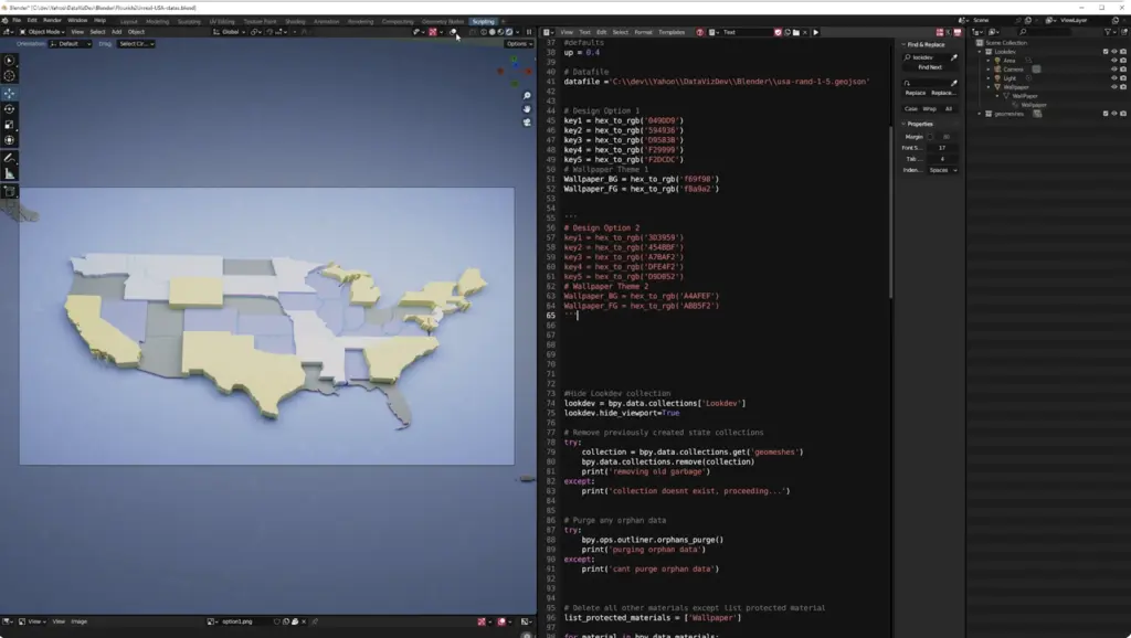
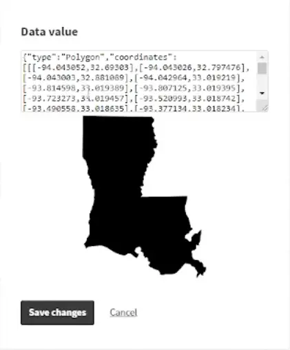
Just like in a previous article, one can also read GeoJSONs in Blender and create, for example, the shapes of the USA states.
The process in this case is quite straightforward: Blender has tons of material on how to generate points, vertices, and faces in Python. A GeoJSON is just that—points, shapes, lines, polygons, etc.
It’s actually fairly easy to create renderable geometry using the Python API, data processing tools, and much more! The sky is the limit. Well, no, the amount of GPU RAM is the limit.
More datasets
By having all this 3D goodness ready and mapped, anything can be proportionally mapped to represent data visually, neatly, and using modern rendering techniques like ray tracing, etc.
