Intro
This is the story of how Ted McGrath (creative director at Yahoo) decided I am a data scientist. The conversation went like this:
# One day at Yahoo
Ted: "Hey Seb, do you know anything about data science?"
Seb: "I know 2+2 might not be 4 in another universe."
Ted: "Excellent, follow me, my lad."
The Problem
Ted’s problem was actually an easy one. He had a bunch of data and wanted 3D visualizations for it. So the next morning, my email was filled with lots and lots of files containing numbers.
Inside the email (not just in, but literally inside—like Santa Claus’ bag on Christmas), there were:
- JSON files | GeoJSON files | XML files | Pictures (?)
Okay, the only way to tackle this is to get 1kg of EDA.
EDA - Exploratory Data Analysis
The very moment you realize you have to do EDA; congratulations, you are a data scientist.
The very short story about EDA is: You have to do it. There is no way out of it. And there are many approaches to it. Here, I’ve listed the ones to avoid:
- Convert JSONs to CSV and then check them in Google Sheets? No
- Use online tools for GeoJSONs? No
- XML files? No, no
- Pictures? Oh no, no
When it comes to EDA, there is only one tool that can give you something workable: Python’s Pandas. Along with Rule #1: Check your dataset!
A couple of EDAs later, I had a pretty good idea of what the data was and how to use it. Let’s go in order:
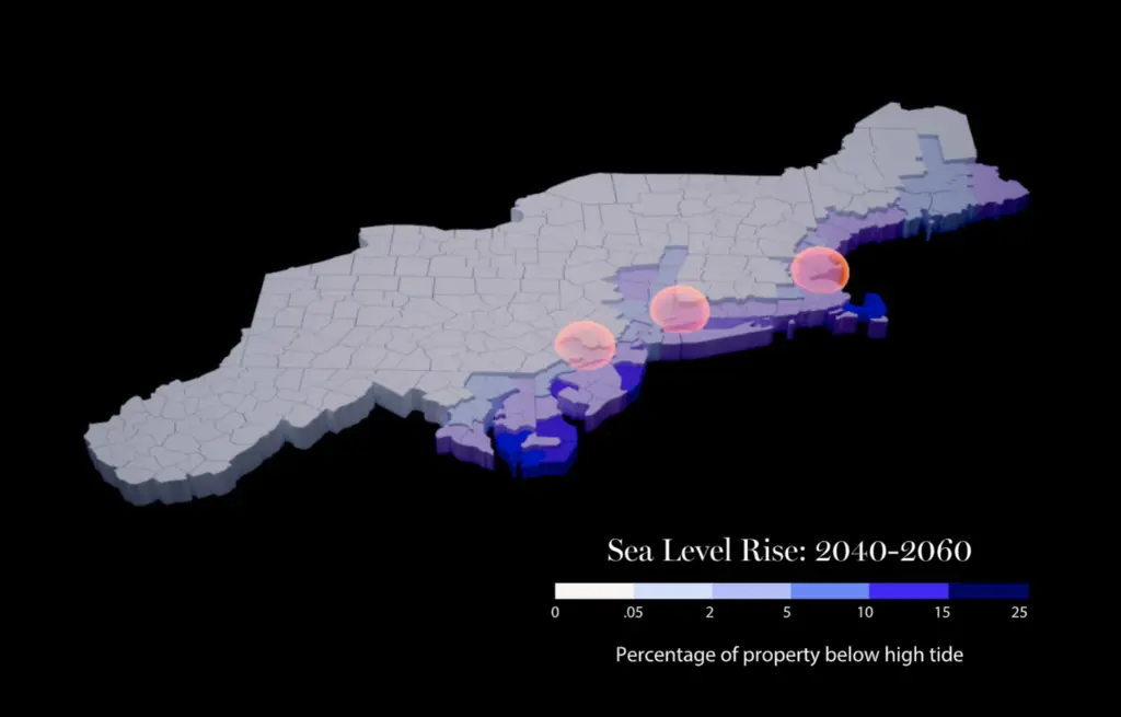
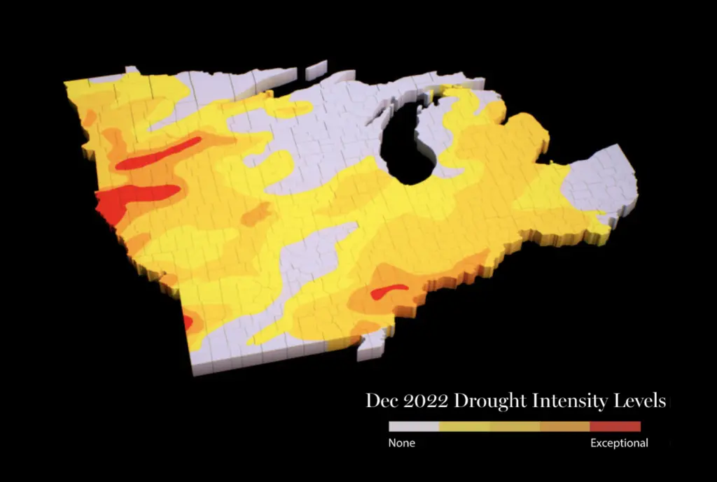
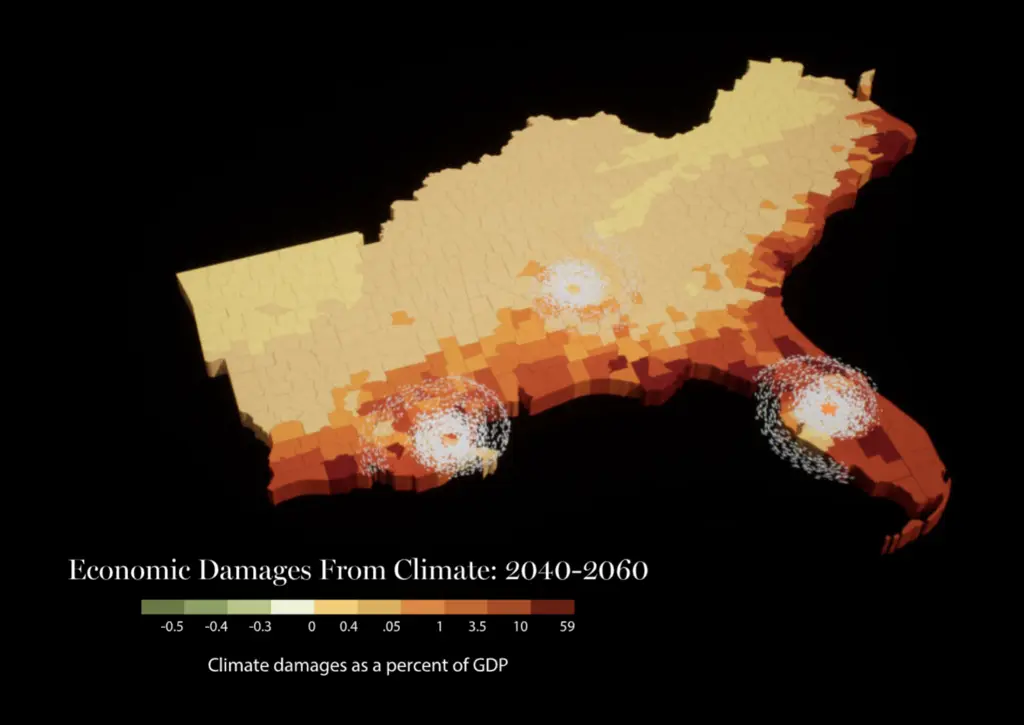
- GeoJSONs contained:
- GeoJSON data of USA counties.
- County-specific datasets per category of data.
- JSONs contained global USA-specific data.
- XML files contained original datasets before someone converted them to JSONs.
- Pictures contained references on how the data visualization should look. Or thereabouts.
The Brainwave aka The Master Plan
What if: I read the GeoJSONs, which contain geolocations/shapes, and rebuild USA counties as geometries? And also, the GeoJSONs contain the State of the county, which resolves clustering or grouping by default. From there, all I need to do is to map datasets from JSONs into a 2D space and use Houdini magic to create morphing effects of data visualization changes.
Well, Python’s Pandas can be used in Houdini! Actually, in Houdini, you can install almost any Python module.
The GeoJSONs in Houdini
GeoJSON Polygon: Polygons consist of an array of GeoJSON LinearRing coordinate arrays. These LinearRings are closed LineStrings. Closed LineStrings have at least four coordinate pairs and specify the same position as the first and last coordinates.
So what one can do in Houdini is read the data (coordinates of the points) and create N-gons. N-gons can be subdivided into polygons, and with a for loop, one can easily get structures like this:
The Data Overlay
JSON files may contain a lot of data. But eventually, I found out that the data is in the shape of points—each containing data. This clicked because the whole paradigm about Houdini was (not anymore), everything is a point.
So if one has temporal data (data that changes over time), one could read:
- The point (location)
- The data (temperature)
- How that data changes over time (the point will have different values over time)
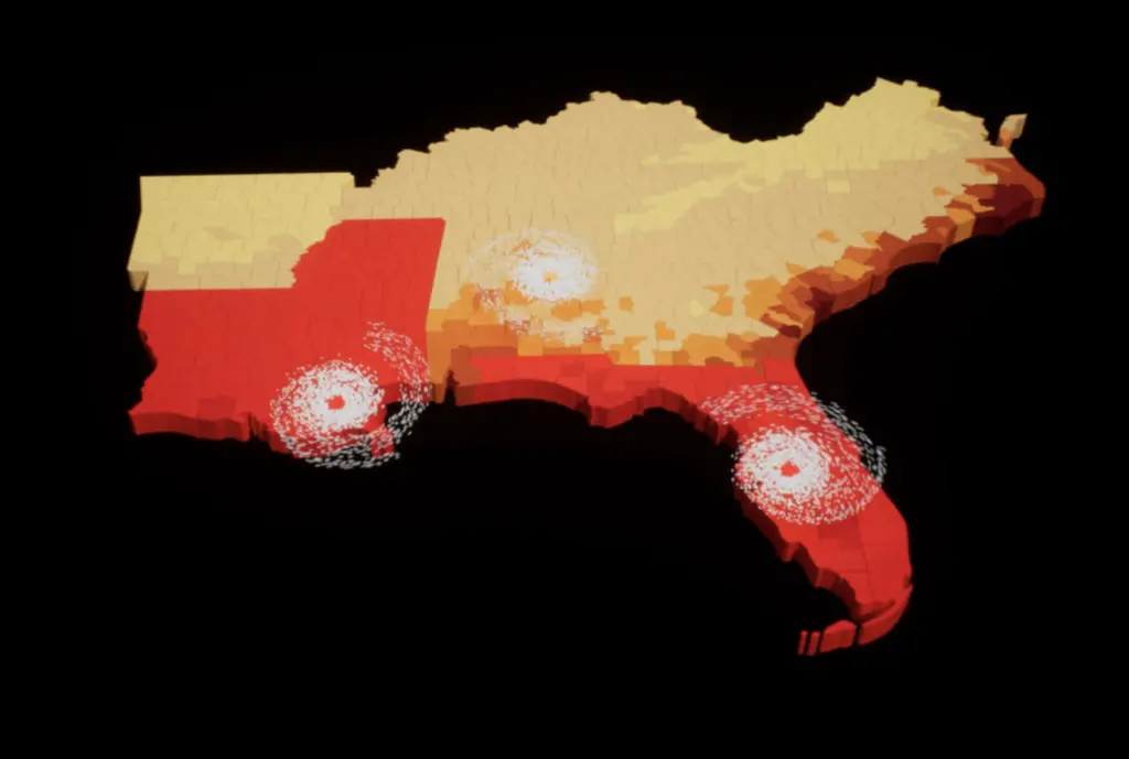
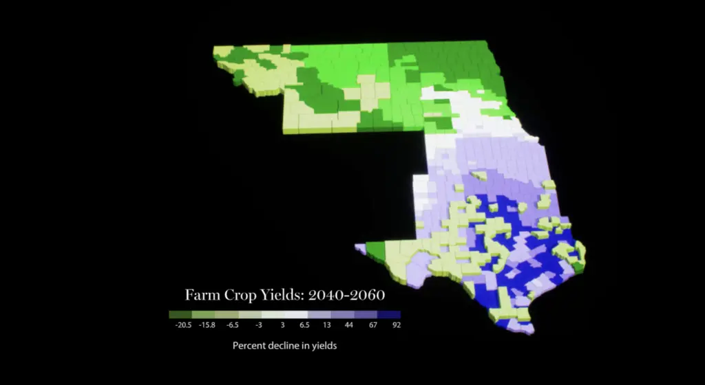
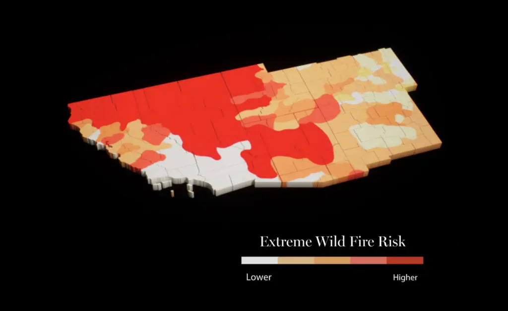
By assigning different data values to different frame numbers in Houdini, one can produce animations like this:

The Result
Live website here